The Goal
Redesign the desktop website while solving all the pain points encountered and make it responsive so it can be accessed by mobile users.
My Role & Project Duration
UX/UI designer. Analysis, wireframes, design and prototyping during 3 weeks - February 2023
Introduction
00
Looking for a project in which I could start learning Adobe XD I ran into my local library website in Madrid. I thought it would be a good idea to give it a fresher look while keeping the exact same modules the orignial website has and at the same time addressing all the accessibility issues and pain points I had myself as a user.
The result is a flexible responsive website that can be use for all the network of different libraries in the capital with minimal changes in content that keeps the distinctive red colour of the capital and incorporates a warm feel with the rest of the palette.
Analysis
01
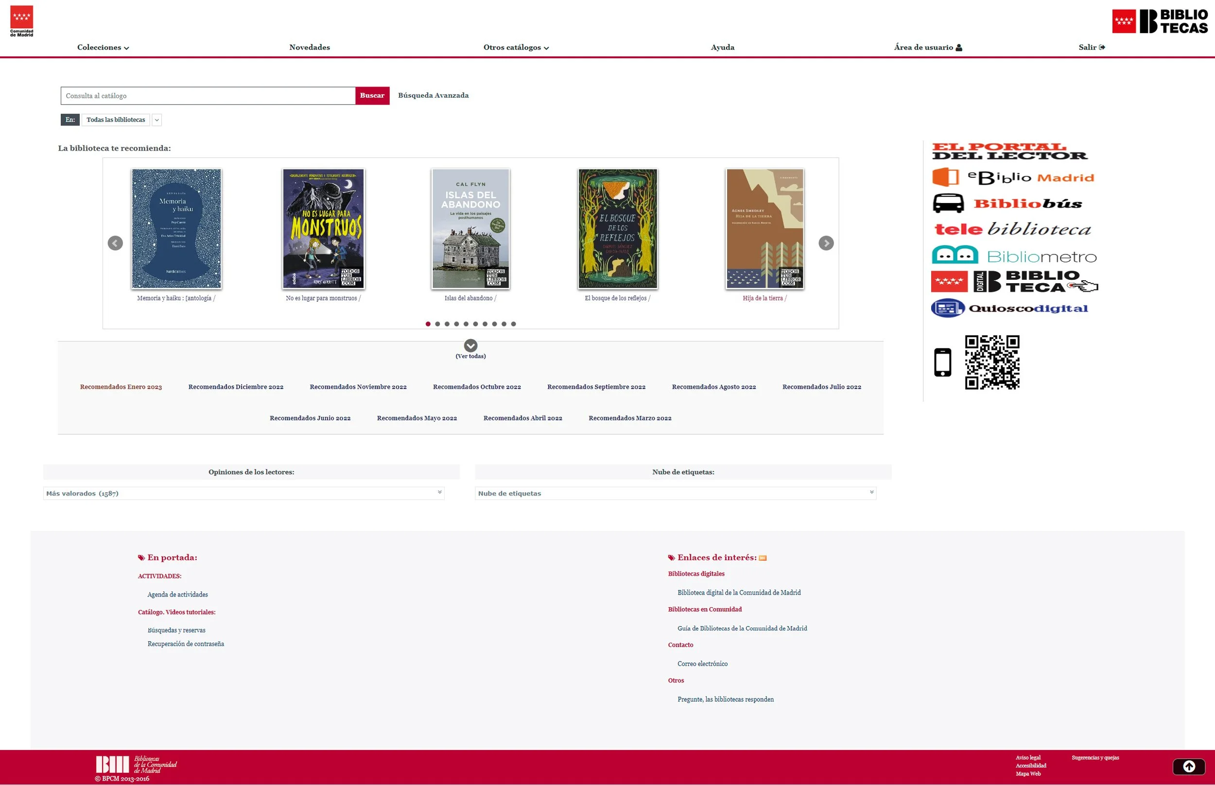
My initial impressions were that the original website was not fitted for current screen resolutions.
All the modules seem to be stretched across the width of the page and there is no hierarchy between them.
The search tab is very complete but it could benefit from using the whole screen and more spacing between the input bars.
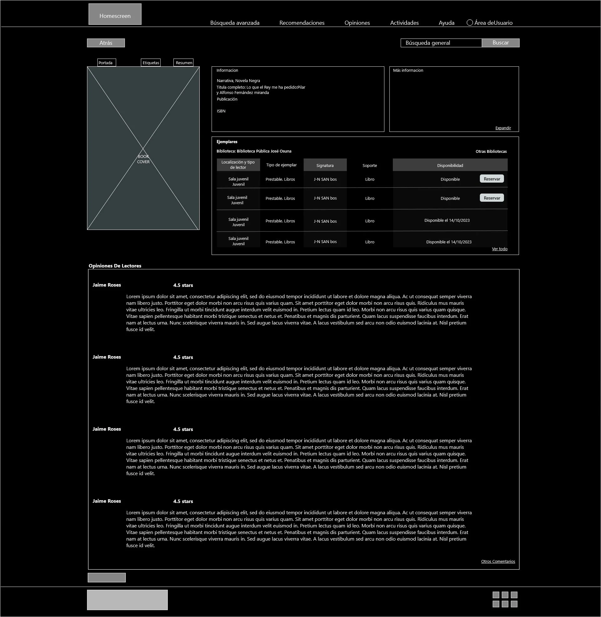
The book page has a lot of information hidden in tabs. The copies availability is not visible at first glance.
This page would also benefit from having the readers reviews already displayed to better connect with the user.
The webpage is not responsive, accessing by phone will only scale it down difficulting the reading and resulting in a bad user experience.
Research/Pain points
02
Difficult navigation
The website is not responsive, accessing it by phone scales down the desktop pages resulting in a poor user experience.
Not mobile friendly
The text heights between headers, paragraphs and other titles have little distinction making the information harder to read.
No hierarchy
Lack or heirarchy and scale,important information hidden or difficult to find, site outdated.
Prototypes/Wireframes
03
Information Architecture
04
Typefaces
05
Colours
06
UI Design
07
New Design
08
I kept the same amount of information with a hierarchical website structure but gave all the elements more space to breathe. The proportion between elements improves the legibility of the home screen.
The most important improvement was the creation of a responsive website giving the phone users a suitable user experience for the mobile phone screen size.
The book information page now has the availability information displayed at the beginning; the book cover has also become more prominent and the reader’s reviews are now shown when you scroll down the page.
I tidied up the Advance Search page but kept all it’s functionalities. I also made the search button more prominent and kept the secondary search buttons alligned in one column.
Takeaways
09


