My Role & Project Duration
UI/UX design for desktop project and dedicated mobile app - 2 weeks duration February 2023
Project Goal and Objectives
Creating a design that will raise the quality bar from the rest of low-cost airline sites and apps on the market offering a fresh, solid and comforting alternative
Key Challenges & Constraints
To come up with a design that highlights and makes use of all the innovative features that Norlus has to offer in a way that translates into added value to the user and helps Norlus to position as a XXI century Airline.
Briefing
01
About Norlus
Norlus is the new low-cost airline of Iceland Air. In contrast with the main airline it aims to fly different routes mainly outside Iceland. Their business model is to transport passengers that need to move between islands, and from mainland to an island or vice versa.
Their destinations will include most of the islands in the Mediterranean and their target users are urban, connected young people (18-45y.o) that like making weekend improvised trips, summer trips and/or visit their parents abroad.
Norlus will differentiate from the competitors by flying the most up-to-date fleet that will incorporate features like sustainable available fuel, pet friendly flights, local snacks, XL seats, free wifi and HBO entertainment system onboard.
Its services aimed for young adults include one click check-in, crypto currencies payments, 24h before flight ticket ownership transfer, Lonelyplanet city guides and Google Calendar integration.
Profile
02
User Persona
A young (18-45) person not tied to one place, possibly working remotely and moving around getaways, going on summer trips, visiting relatives or movin another country.
REASONABLE PRICE
EASY AND QUICK BOOKING
FRIENDLY INTERFACE
Typefaces
03

04
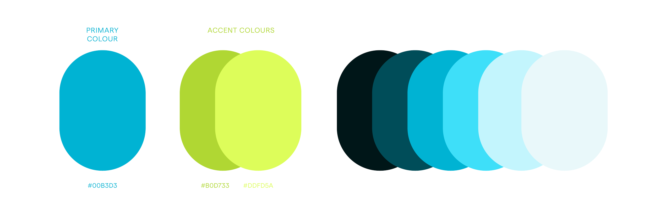
Colours
Visual Metaphor
05
Look Through & Discover
The window, used as a visual metaphor symbolizes a perspective, or an opportunity. It also implies a view of something by framing the content where the expectator experiences the contrast between the inside and the outside.
The Intro
First impressions matter. Peaking through the Norlus logo to start a new adventure and discover a new exciting destination will take you to the intro that will showcase curated videos of our destinations and will vary each time you access the website.
UI Design
06
The destinations and services
Booking a ticket
Choosing your seat
07
Mobile
Mobile Version
Native app that focused on a transactional aspect but that will also act like a travel companion offering features such as boarding tickets, flight status and free travel guides.
Takeaways
08
One important lesson that I learnt from creating this project was to develop a cohesive brand identity by using a visual metaphor alongside a number of design principles selected after an initial market study. Looking at the results I really value how all the elements are related and talk to each other and most importantly how it stands out from the competitors.


